The Portal Educação Refactoring Project was created with the objective of visually improving and updating the platform, mapping the old features and removing them to make room for more current and relevant items and create a responsive experience for the platform.
We received from the Portal Educação team a brand manual and researches carried out with the students that were essential for the visual construction and functionalities for the new platform. These contents guided the way of using the platform, the most important features, prediction and suggestion of possible improvements and/or adaptations and the exclusion of obsolete features prone to usability problems.
To start the project, a survey of the main items to be discontinued was carried out, such as: See Friends on the Map, Test your computer, External Links, Media Library, Chat, Notes Field, among other items.
After this survey, we kept in touch with Time Portal Educação, always looking for new suggestions for improvements and presenting the results achieved during each stage.
We made benchmarks to raise the greatest possible number of possibilities applicable to the project, making comparisons and tests of the best features and visuals proposed on the market, which could be used, since most users would already be familiar with certain features. Without reinventing the wheel and adapting it to our reality.
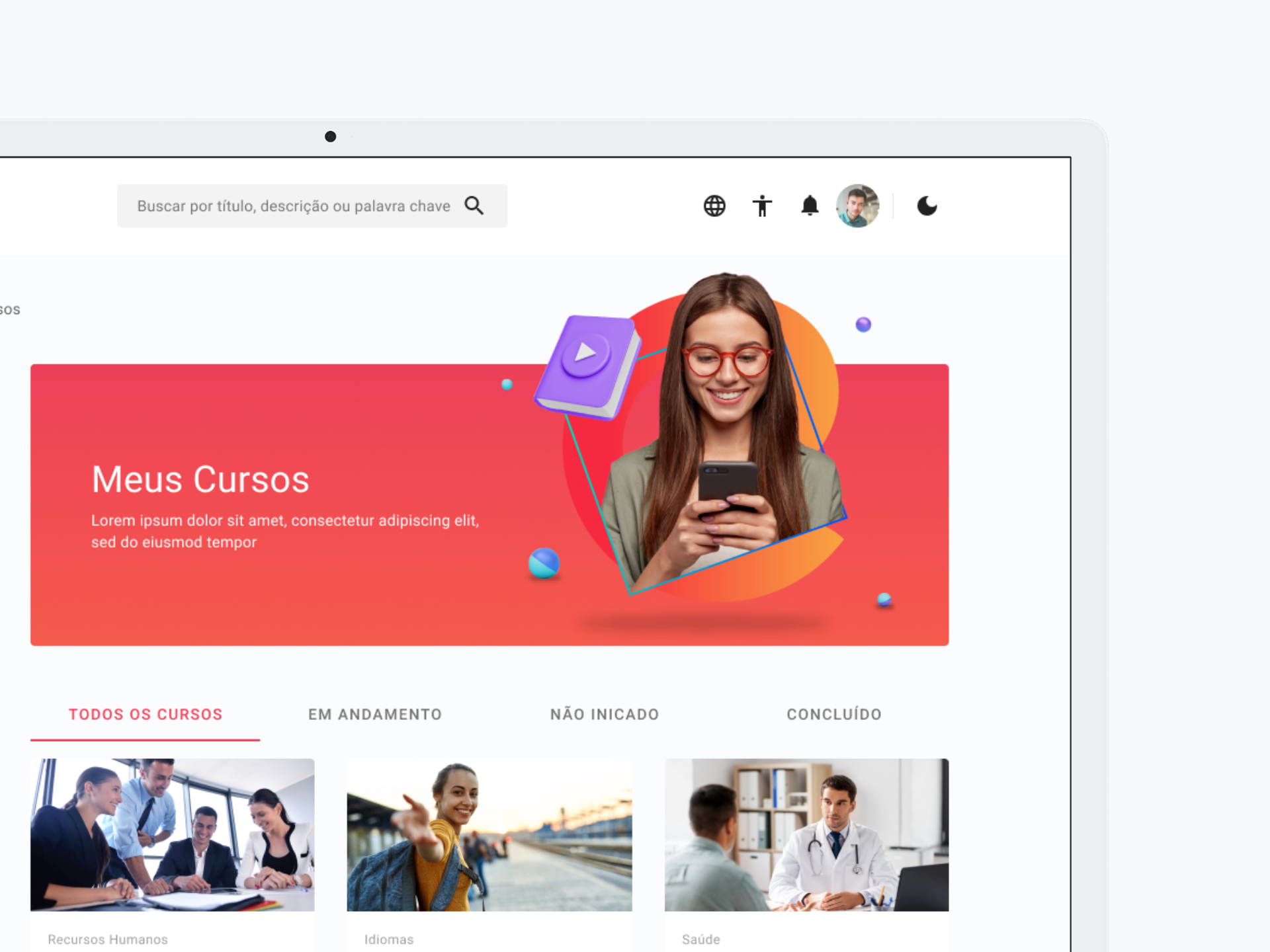
Bringing together all the possibilities through a framework of ideas, efforts and impacts were mapped, organizing situations that could be used in a simple way for the user. Step-by-step, screen by screen, from login, through the home, courses, assessments and classroom.
The construction of the interface followed the framework (Angular Material: Angular Material is an implementation of Material Design in Angular made by Google. It is composed of several components, CSS libraries and other elements, and is part of the package manager of Node o NPM, which can be considered another feature that you can add to your Angular project.) that ensured delivery in the most assertive way possible and whenever necessary, with the necessary adaptations to the project.
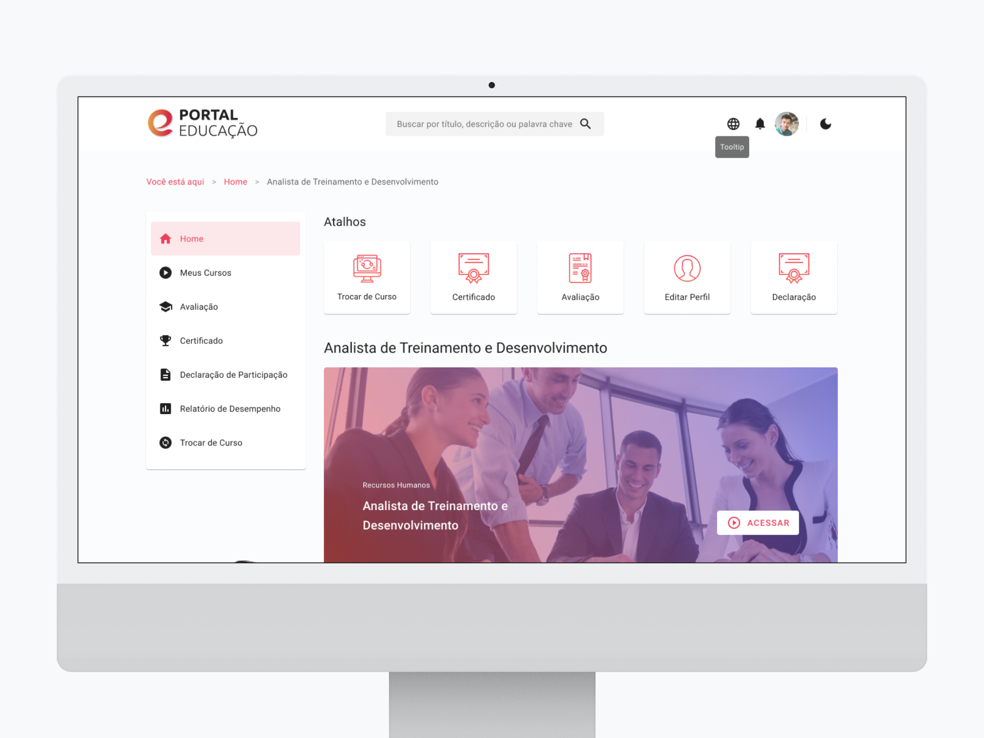
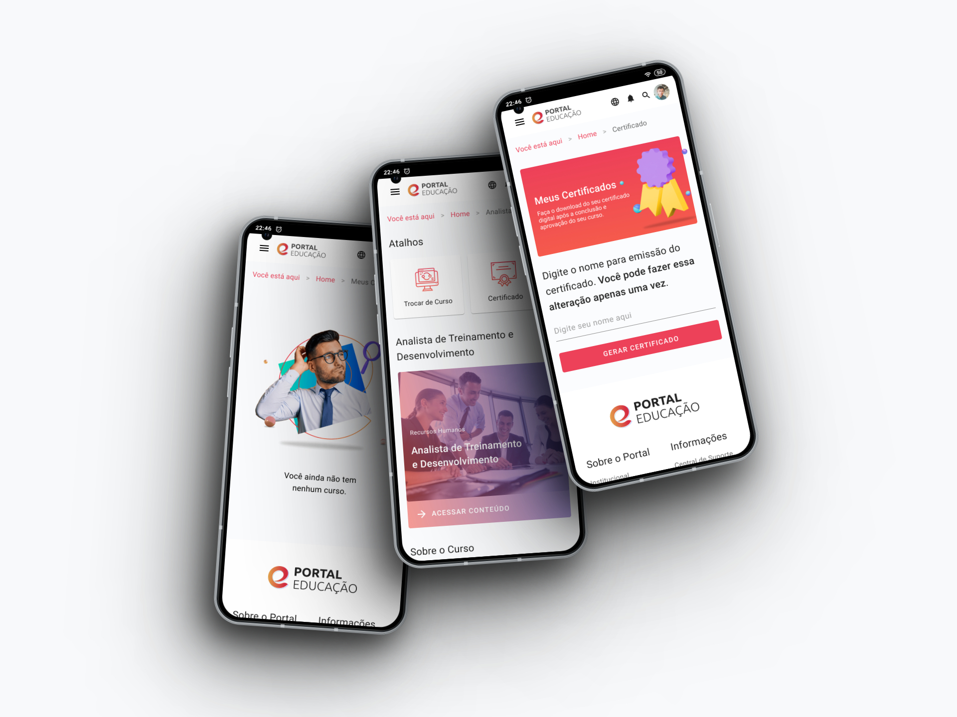
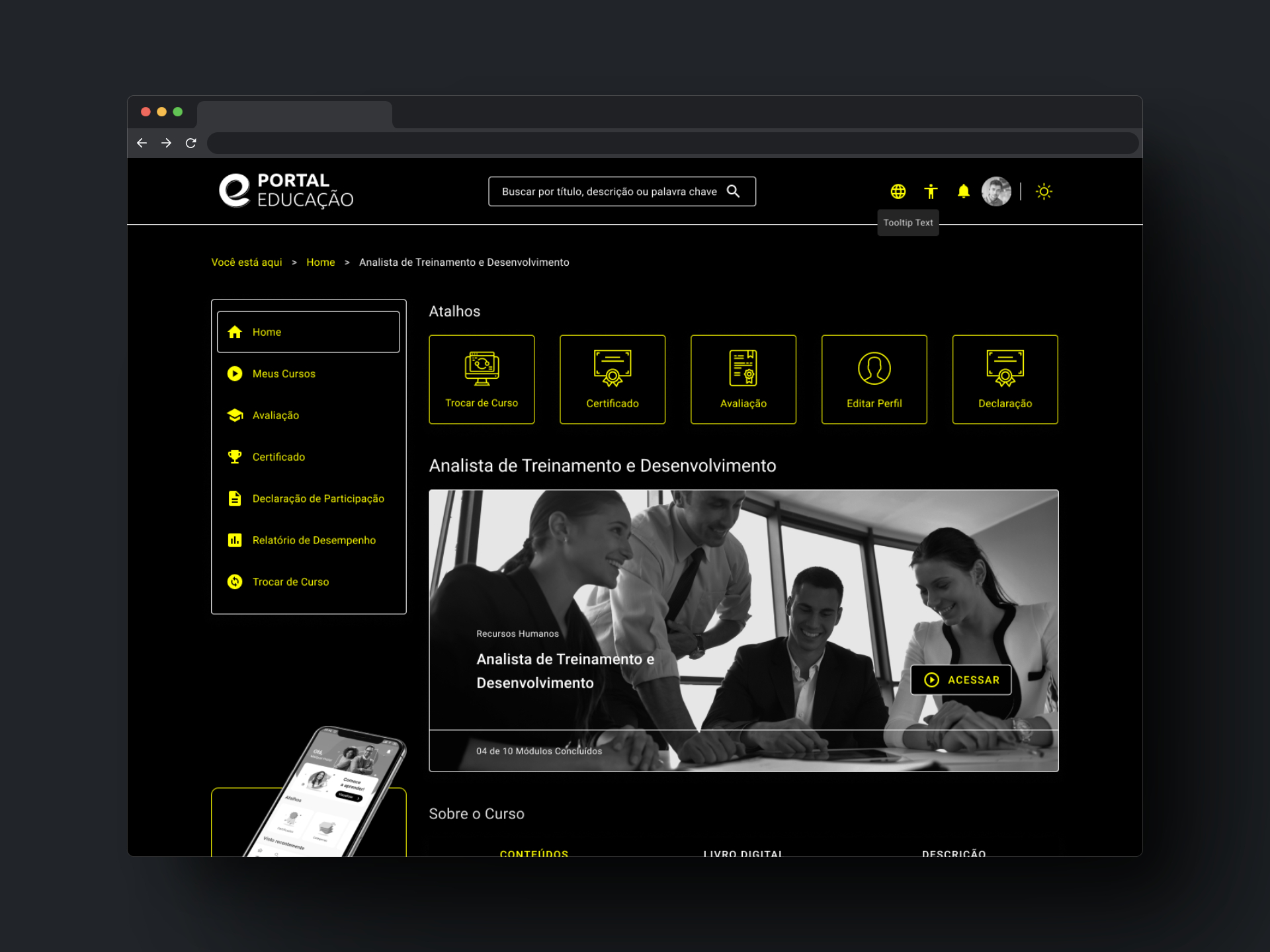
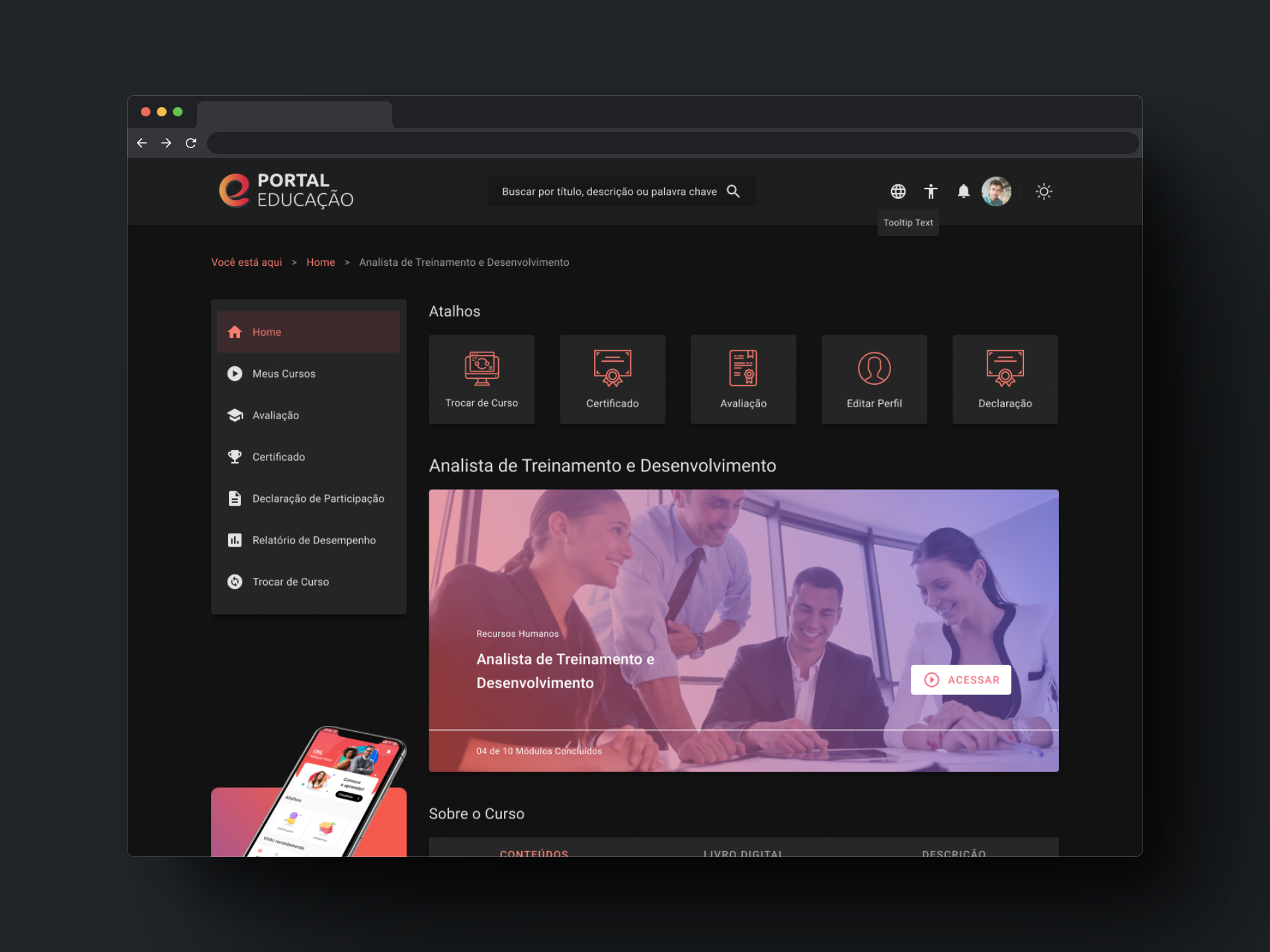
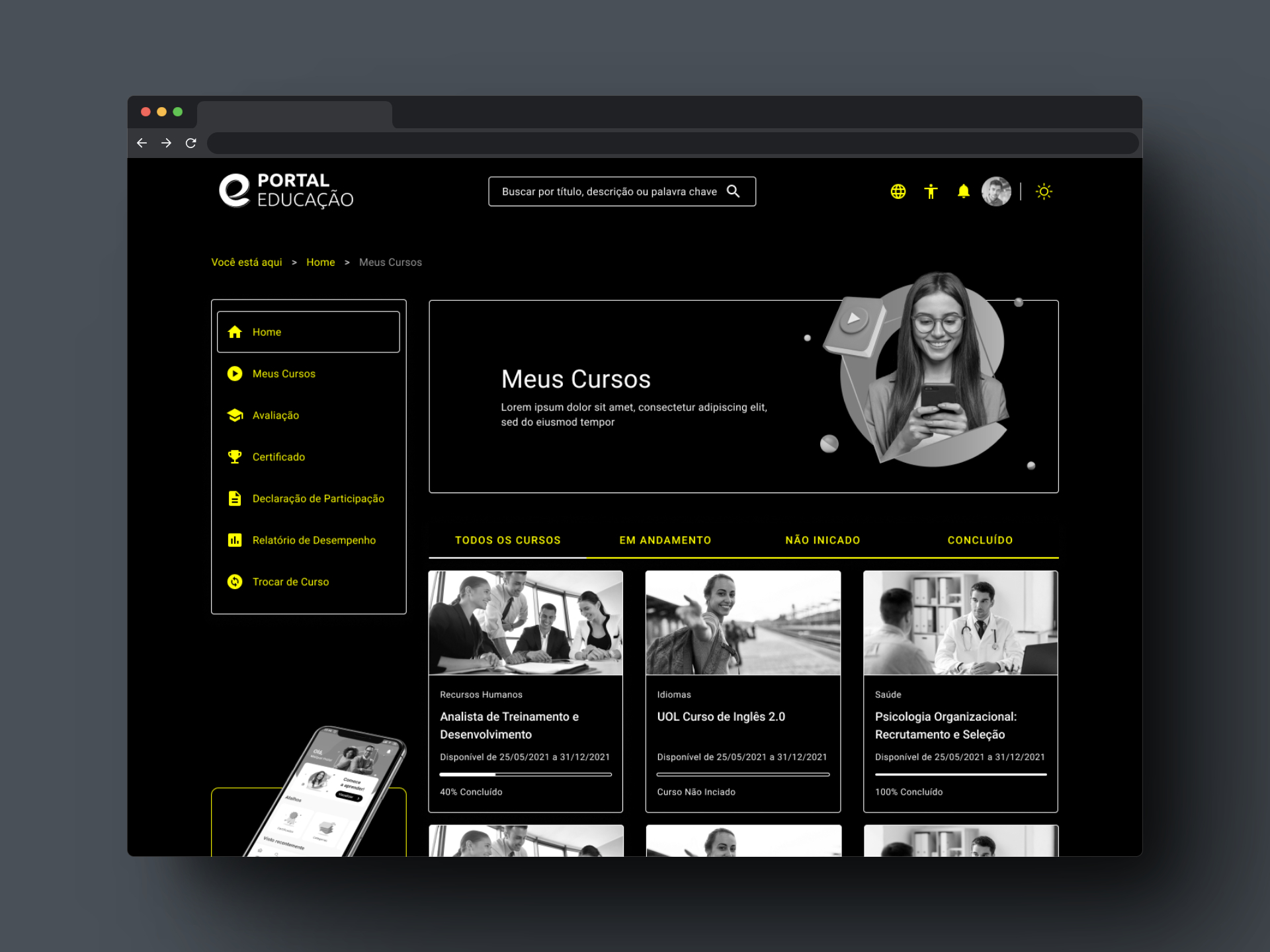
An exceptionally adapted project, thought to provide accessibility to all people. In addition to responsiveness, our design includes high contrast modules and the option of dark mode, ensuring that all users have a comfortable and pleasant experience.
Throughout the project, the agile methodology in sprint division was used in order to prioritize the highest value deliveries. With the premise of guaranteeing screens adaptable to the resolutions of different devices, BootStrap emerged as the best technological solution to optimize production and screen uniformity.
To ensure the best user experience on any type of device, every responsive part of the project was developed. In addition, the product has The Dark Mode — also known as night mode or dark mode —, a function that changes the color palette used by cellphone applications to darker tones and the High Contrast Mode — High contrast makes text easier to read in the device. This feature sets the text color to white or black depending on the original color of the text.
The Project had in its entirety 04 months of hard work and dedication, all the planned modules were delivered, as well as the responsive version of them.